Los Angeles
Brand website design
Build a RWD responsive website
Let your website adapt to various devices and provide the best user experience, with RWD technology at your fingertips.
What is responsive web design?
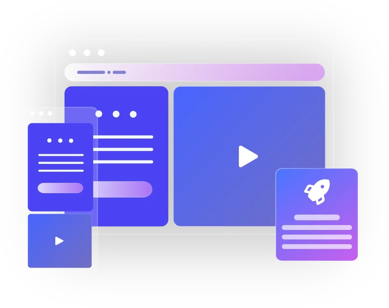
Responsive Web Design (RWD) is a modern web design strategy, the core of which is to enable the website to automatically adapt to different sizes, resolutions and types of device screens. Whether users are browsing on a smartphone or reading in depth on a tablet or computer, a responsive website ensures that content is presented in the best possible way without requiring additional action from the user. In summary, RWD responsive web design is a flexible, adaptable design approach that aims to provide a seamless web experience for all users, regardless of the device they are using.
Comprehensive analysis of the importance of RWD responsive web design
Create excellent user experience to drive SEO and business growth
Improve user experience
RWD ensures that the website adapts to the screen sizes of various devices, so that users do not need to do too much to adjust the view. This directly improves the user's reading experience, increases the user's stay time and interaction rate on the website, thereby increasing user satisfaction.
Strengthen SEO and web visibility
Search engines are paying more and more attention to the multi-device adaptability of websites. By providing a single URL and HTML code structure, RWD can not only avoid content duplication problems, but also be more easily recognized and indexed by search engines, thereby improving search rankings and SEO results.
Save development and maintenance costs
Rather than developing separate websites for each device, RWD only needs to maintain one version to cover all devices. This greatly reduces the time and cost of development and maintenance, allowing enterprises to invest more resources in content improvement and user experience optimization.
Improve conversion rates and business benefits
A better user experience makes it easier for users to complete various operations (such as shopping, making appointments, filling out forms), which directly increases conversion rates. More potential customers are converted into actual buyers, thus creating more revenue for the business.
Let creativity have no boundaries and make success easier
Weber becomes your RWD website production expert
Unify website and marketing strategies to reduce costs
Weber Responsive Web Design (RWD) provides a highly cost-effective website production solution. With a one-time investment, businesses can have a unified website that works on multiple devices such as computers, tablets, and mobile phones. Not only does it save the high cost of multi-version website development, it also simplifies marketing activities. And using a single URL for promotion reduces the complexity of maintaining multiple URLs and increases brand recognition and consistency. This kind of integration strategy reduces the company's expenditure on advertising and promotion, and also improves the efficiency of marketing, allowing the company to focus more on content optimization and precise positioning of target audiences.
Simplify website management and content maintenance
Another major advantage of responsive web design is its convenient website management function. Weber has a single back-end management system, and website content updates can be completed with just one click. This not only reduces labor and time costs, but also greatly reduces the chance of errors. Enterprises do not need to update content separately for different platforms, ensuring that all users can synchronize the latest information as soon as possible regardless of the device they use. This efficient maintenance method not only improves the operational efficiency of the website, but also ensures the consistency of the brand image and the accuracy of the information, allowing the company's digital image to be maintained at its best.
Optimize user experience to increase conversion rate
The core of responsive web design is to provide users with a better browsing experience, which directly affects the marketing effectiveness of the website.Weber's RWD technology ensures that websites can be seamlessly adapted to different screen sizes. Regardless of widescreen, narrowscreen or small screen devices, images and content can be perfectly presented, making users' browsing behavior more smooth and intuitive. At the same time, such a design greatly improves the conversion rate of the website, because a good user experience can often encourage potential customers to browse in depth and interact. In fact, by being designed to be compatible with various devices, the website can attract more visitors and convert their behavior, effectively increasing the company's revenue and influence.
Flexible technical tools support diverse designs
What supports responsive website design is not only technological innovation, but also the strong support of tools.With the automatic configuration function of various design templates and components provided by Weber, you can quickly generate a website framework with a suitable design. Through the drag-and-drop function, the pictures and text elements of the website can be flexibly adjusted to meet the display needs of different devices. In addition, whether it is previewing the effect in the editor or adjusting and adapting to different resolutions and devices, the convenience brought by Weber is obvious. We use the features of modern browsers, such as CSS Grid and Flexbox, to allow designers to complete complex layout designs more easily, ultimately providing users with a more comfortable browsing experience. The comprehensive application of these technical tools of Weber provides profound technical support for responsive design, allowing designers to more easily create beautiful and attractive websites.
Common problem
How to ensure consistency in the display effect of a responsive website on different devices?
The core of responsive websites lies in technologies such as CSS media queries and fluid layout. These technologies enable web pages to automatically adjust styles according to the characteristics of different devices, ensuring a consistent user experience. Using the visual editor provided by Weber, users can easily adjust the display effects of different devices to ensure that the website can be displayed perfectly on mobile phones, tablets and computers without professional skills. In this way, it not only improves the user experience, but also reduces development and maintenance costs.
What are the key factors to consider when designing a responsive website?
When designing a responsive website, consider fluid layouts, flexible images, and CSS media queries. These factors ensure that the website can adjust elements according to the screen size of different devices to provide the best display effect. The Weber platform supports the design of these elements and provides rich widgets and visual editing functions. Users can easily build adaptable website designs without knowing code.
Does a responsive website affect search engine optimization (SEO)?
Responsive websites help SEO. By using a single URL and HTML code structure, responsive design can avoid duplicate content problems and improve search engine recognition and indexing efficiency of the website. Weber's responsive design tools not only simplify website construction, but also simultaneously enhance the SEO effect of the website on various devices, making your website more easily captured by search engines.
What are the obvious advantages of responsive websites compared to non-responsive websites?
Responsive websites ensure the best user experience, improve SEO results, save development and maintenance costs, and increase conversion rates. Weber's responsive design platform makes these advantages more significant. Users can build and manage responsive websites without professional skills, improving business efficiency. The one-stop management and efficient and convenient publishing functions provided by Weber make success easier.

Topkee — Marketing Connected to Revenue
Services
Products
© 2026 Topkee Inc. All rights reserved.